This was an personal project that I wanted to challenge myself on. The Butterfly Foundation is a local non-profit and their logo had always been on my mind as the monarch stood out more than any of the logo. Drawing up concepts first, I wanted to focus more on the B as it was emphasized heavily in the original. So from there I loaded up Illustrator and settled on a serif font in uppercase to keep it traditionally professional and classy. Using the curvature tool I made the butterfly, with the goal to have it be able to replace the B or be used as a logotype.
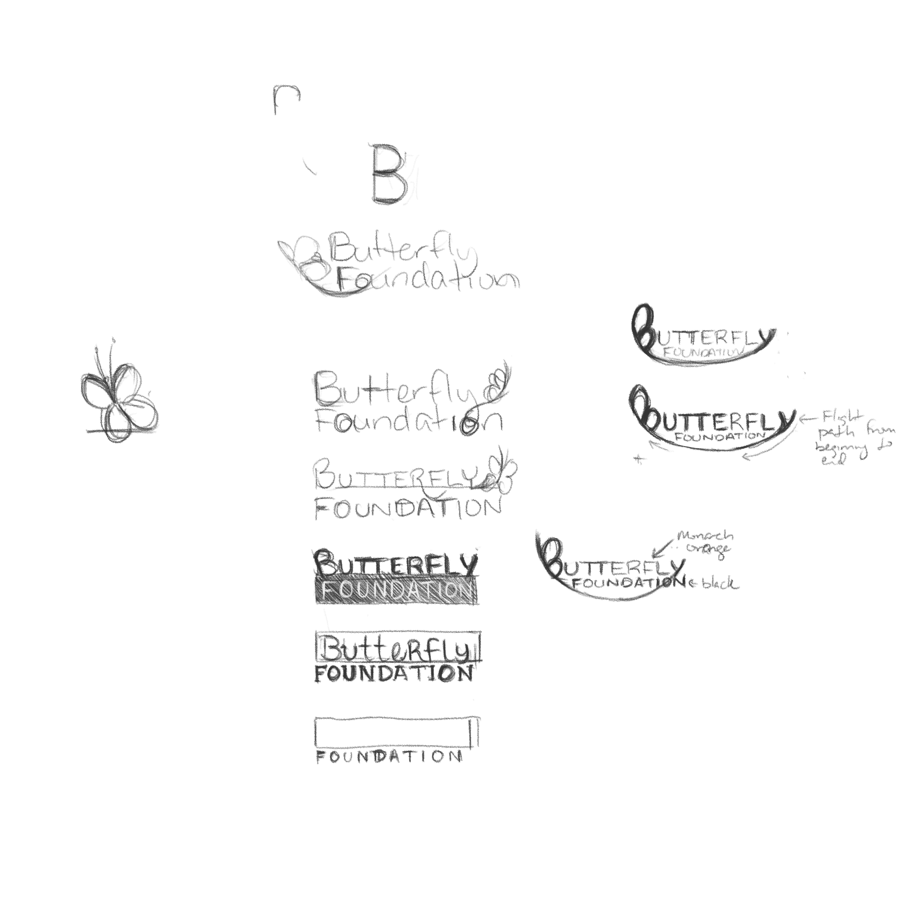
Concepts for the revised logo