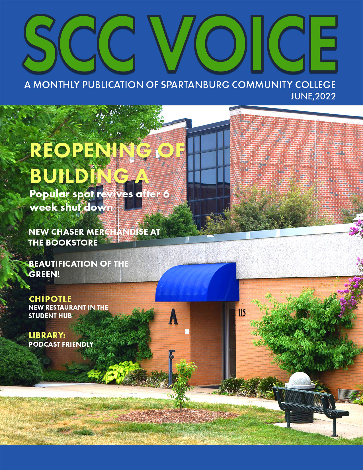
An magazine cover made in Photoshop, the goal was to draw people to the headline, using both the sizing of the font and picture. Keeping in flow with the subhead and if it was to be a digital publication, I stuck with using sans-serif and FX drop shadow. Without the photo adjustments (contrast, light, saturation), it wouldn't have worked well with the color choices for the font.