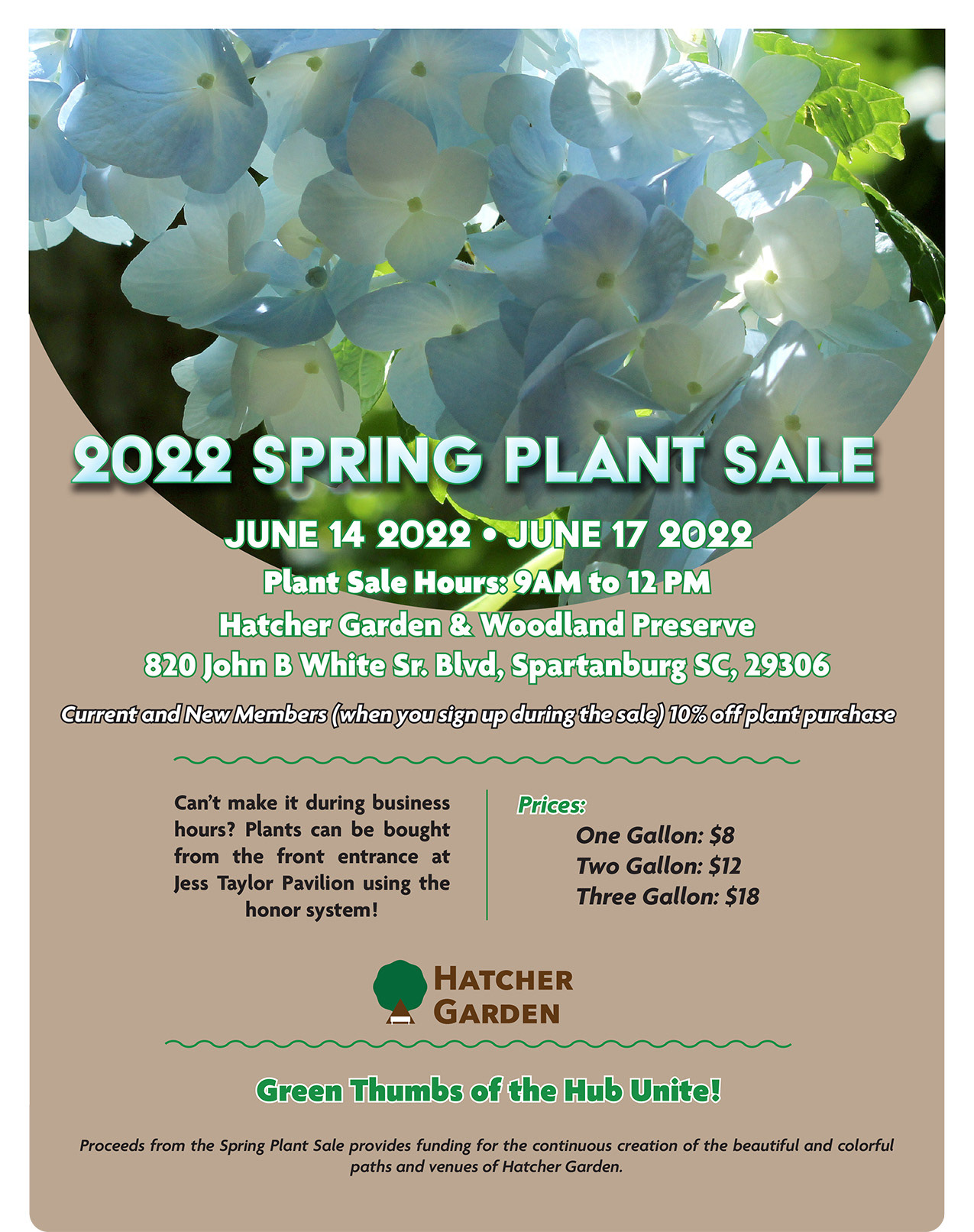
Made during an internship, this ad was one of the first items made to promote the local horticulture site Hatcher Garden. Hatcher Garden's spring sale is the main draw so the use of FX gradient, drop shadow, and stroke on the headline was made to pop against the photo background. Throughout the ad, the usage of greens, whites, and black was to work alongside the photo as the theme is greenery. Centering the writing made it easier for readers to pick up information as it flows with reading left to right.